Projects
/
TD

UX Designer
UX Researcher
Solo Project
2 Months
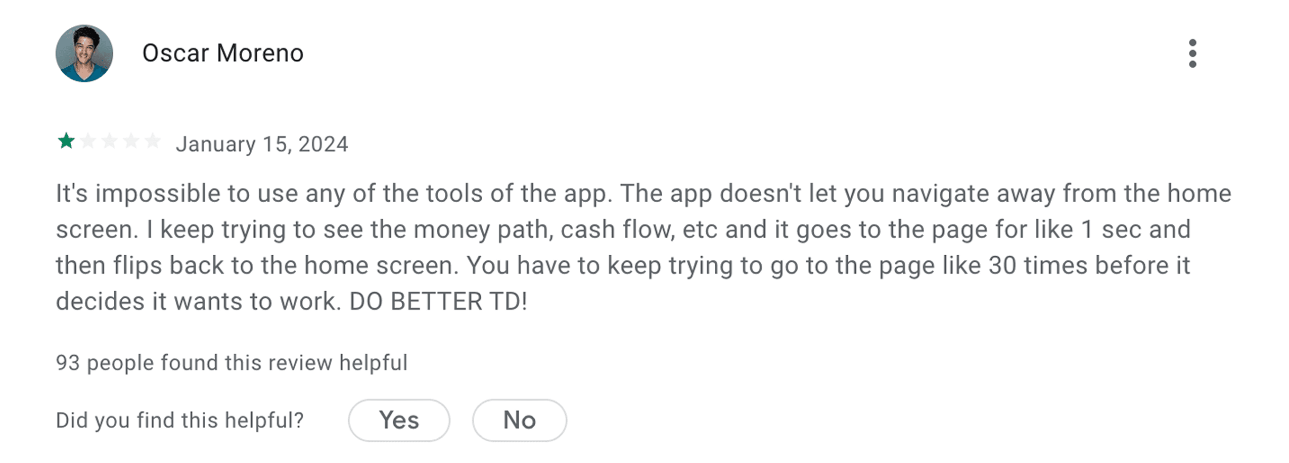
"I open the app to feel in control of my money—but all I get is confusion and dead ends." - Frustrated Customer Review
Problem
TD MySpend makes it difficult for users to understand their spending. Insights are buried, navigation is unintuitive, and the feature exists outside the main TD app—causing fragmentation and delays.
Challenge
Redesign the experience to reduce fragmentation and improve the information architecture, so users can easily access, understand, and act on their spending insights without unnecessary friction.
Solution
Streamline the experience by integrating TD MySpend into the main TD app and restructuring its information architecture. This includes reorganizing content based on user priorities, simplifying visual data, and making key financial insights easier to find—backed by insights from usability testing and user interviews.
Navigation Improvements
Helps users find their most-used actions faster by moving important buttons to the top, reducing friction and decision fatigue.
Redesigned Data Visualization
Helps users understand their spending faster with simplified visuals and clearer information hierarchy.
In-App Integration
Removes the need to switch between apps, making it easier for users to stay on track without disrupting their flow.
Context
Managing finances today is harder than it should be because...
Banking apps prioritize transactions over behavior
Spending tools are scattered and disconnected
Insights are buried and hard to interpret
TD users face added friction because...
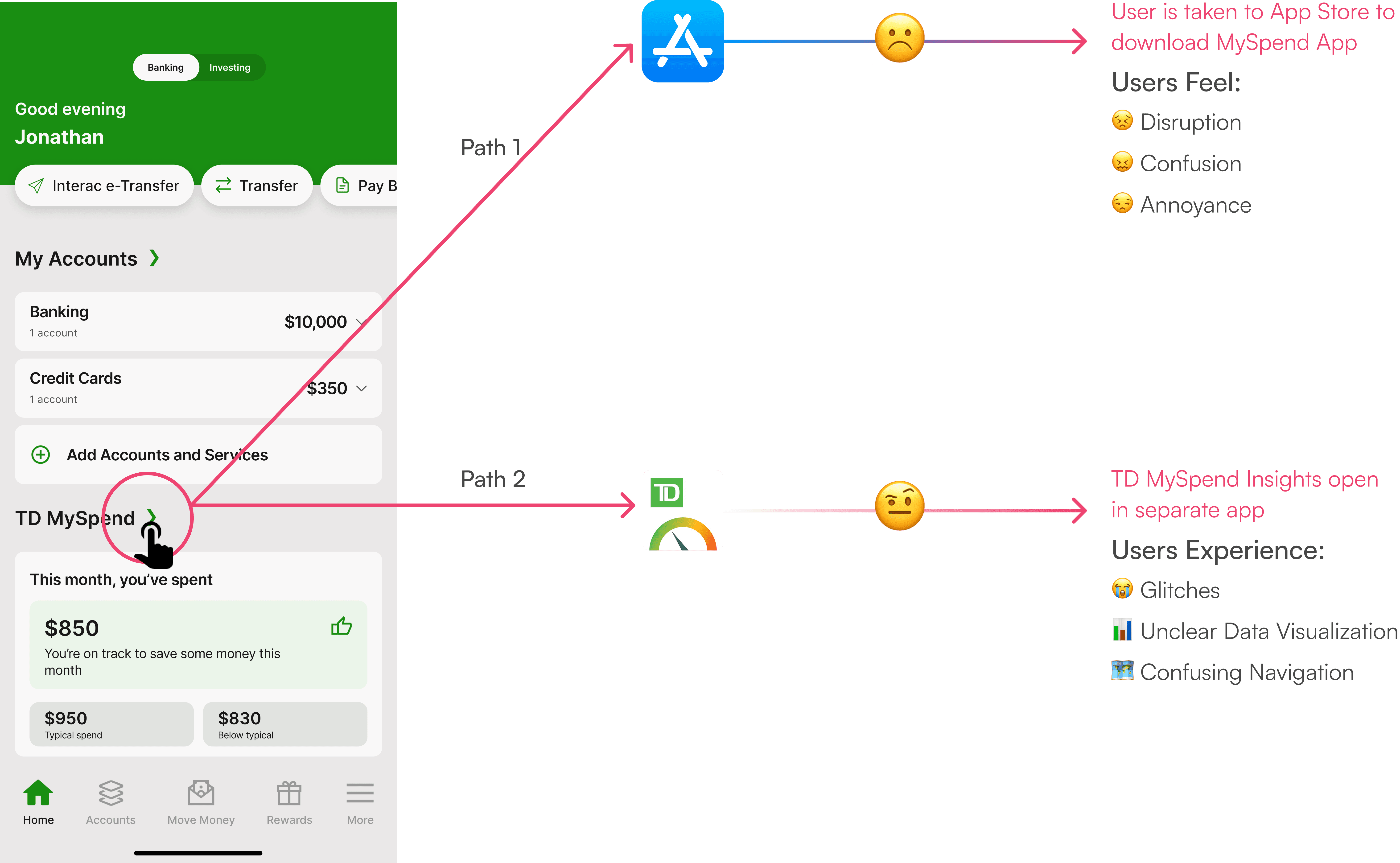
MySpend lives in a separate app
MySpend lives in a separate app
Visuals make insights harder to understand
The app is often glitchy and unstable
Users have been voicing these same frustrations since MySpend first launched in 2016, but little has changed.
This leaves people trying to manage their money with tools that feel outdated and disconnected.


Research Methods
Instead of guessing, I interviewed users and ran usability tests to validate pain points seen in app reviews and Reddit threads. I also measured task completion time and click count to assess friction in TD MySpend’s key flows.
Secondary Research
Analyzed product threads & community forums
To support and expand our understanding, I analyzed 10+ sources including online articles, and community threads.
User Interviews
3 user interviews done remotely
I asked users targeted questions to validate common complaints found in app reviews and product threads.
Usability Testing
3 usability testing sessions done remotely
I ran three remote usability sessions, tracking time and clicks to benchmark the current experience and identify areas for improvement.
Competitor Analysis
App store reviews & used competitor apps
I analyzed RBC Insights, BMO Insights, Scotia Advice+, CIBC and KOHO Insights to see how they handled spending insights and how TD MySpend compared.
User Interview Findings:
The findings below summarize the key insights my team and I gathered through usability interviews, highlighting pain points and areas for improvement in the current roommate search process.
3/3 Participants Struggled to Navigate Smoothly
Participants paused and backtracked as the path to the correct screen wasn’t immediately clear.

2/3 Participants Felt Visually Overloaded
Too many on-screen choices slowed decision-making and added friction to completing simple tasks.

2/3 Participants Experienced App Glitches
Two out of three participants encountered glitches like lag and unresponsive taps, interrupting the flow and causing frustration.

Usability Testing Task:
Users were asked to navigate to the screen that displays their monthly spending total and count how many clicks it took to get there.
Usability Testing Results:
The findings below summarize the key insights my team and I gathered through usability interviews, highlighting pain points and areas for improvement in the current roommate search process.
On average, it took users 1 minute and 4 seconds to complete the task.
An average time of 1 minute and 4 seconds signals a high cognitive load for what should be a quick, routine task.

On average, users needed 27 clicks to complete the task.
With an average of 27 clicks, the task required more effort than expected, pointing to inefficient navigation and unnecessary steps.

Competitor Analysis Findings:
The Competitors we reviewed included Kijiji, roomster, spareroom, roomies, facebook marketplace and roomi, and from reading reviews and actually using the app ourselves, we found the issues and gaps where we can stand out.


Competitor Analysis Graph:

No Seamless Access
MySpend Is the Only Tool Without In-App Integration
Unlike its competitors, TD forces users to download a second app just to access spending insights. This extra step adds friction, causes drop-off, and makes the financial experience feel disconnected.
MySpend Falls Behind Competitors on Navigation
TD MySpend’s layout is cluttered and unintuitive compared to RBC, BMO, and KOHO, where users can easily find insights. Poor navigation increases frustration and discourages users from checking their finances regularly.
Confusing Insights
MySpend Is the Only App with Unclear Spending Insights
Where other apps present clean, simple breakdowns of spending, TD overwhelms users with confusing visuals and unclear categories. This makes it harder for users to actually understand or trust their own data.
Vision for Improvement:
The goal is simple: make it faster and easier for users to access the insights they care about.
Today, it takes an average of 27 clicks and about 1 minute and 4 seconds just to reach the monthly spending screen in TD MySpend. This unnecessary friction discourages users from regularly checking their finances, undermining the tool’s purpose.
By streamlining navigation, integrating MySpend into the main TD app, and surfacing key insights upfront, the experience can shift from overwhelming to intuitive — helping users make smarter financial decisions faster.
Problem Statement
Before ideating, I created the problem statement below to guide the direction and ground my design in real user needs.
" How can TD MySpend help users better understand their spending through a solution that reduces friction and confusion, so they feel more in control of their finances and confident in managing their money? "
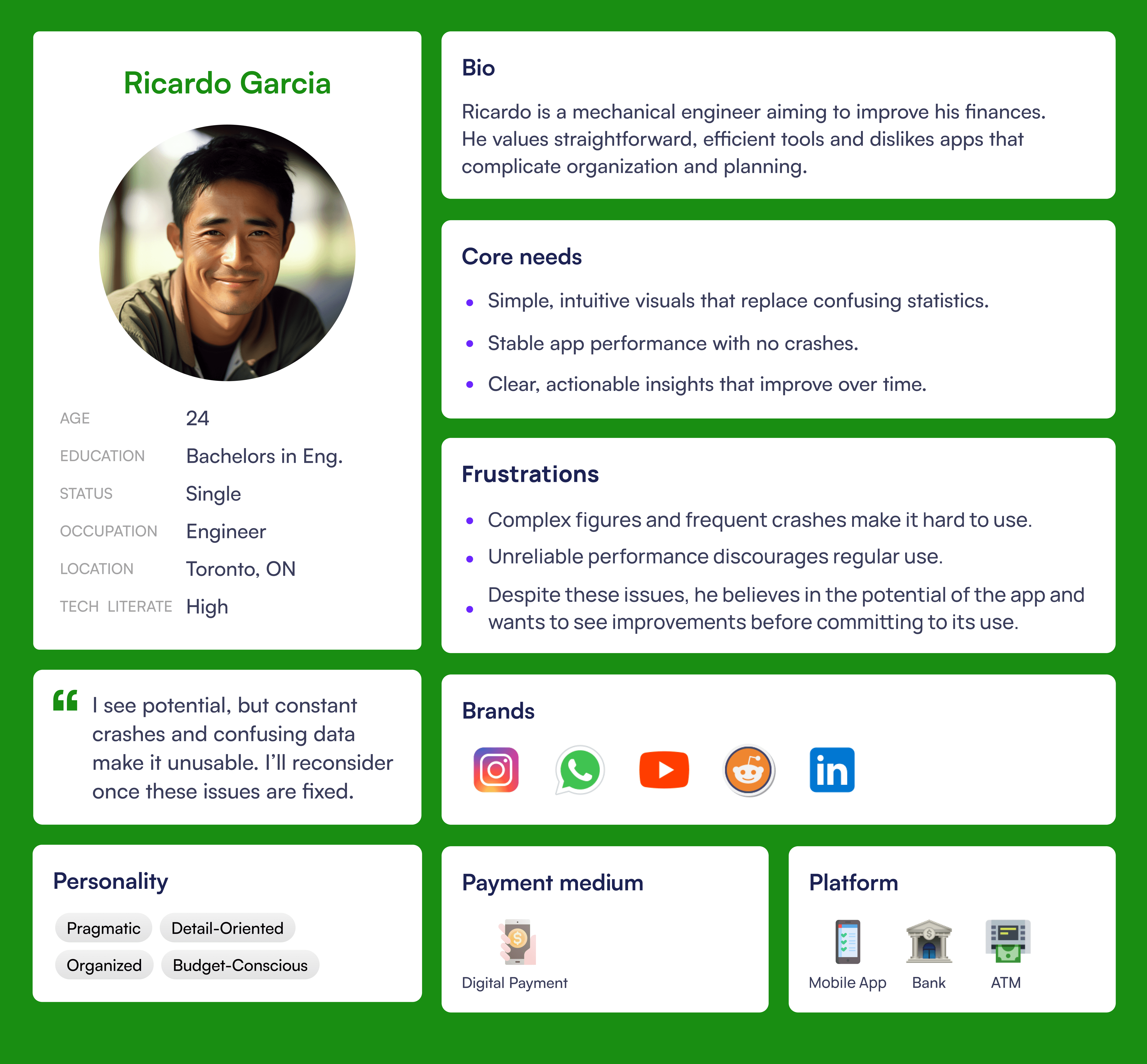
Persona
Ricardo represents the user who’s frustrated with confusing financial tools and just wants a simple way to track and understand his spending.
User Journey
Ricardo’s journey reflects what many users experience, feeling cautious, curious, and unsure when trying to manage their spending.
Users often question if their financial insights are accurate, feel skeptical when faced with unclear data, and get overwhelmed by confusing navigation. It all points to one thing: the current spending experience is full of friction and uncertainty.

Area of Focus
Using insights from the journey map analysis, I focused on creating solutions to improve the exploration and frustration stages where users struggle most.

Potential User-Centered Solutions
These solutions were identified as having the highest potential to improve the TD MySpend experience, informed by user interviews, competitor analysis, user journey mapping, and secondary research.
Seamless Access
Simplify the Journey
Clearer Insights
Faster Insights
Prioritization Matrix
To ensure solutions were both impactful and realistic, I organized them based on user impact, technical effort, and business value. This helped prioritize the highest-leverage opportunities to improve the MySpend experience.

Design Strategy
I prioritized solutions based on competitor analysis, user journey mapping, and usability testing findings, focusing on the areas with the highest user friction and opportunity for impact.
Integrate MySpend into the main TD app
To remove friction and match competitor standards, addressing feedback from 2 out of 3 participants who reported frustration with app switching and performance issues.Restructure the MySpend dashboard navigation
To improve task efficiency and ease of use, after 3 out of 3 participants struggled to find key insights within the current structure.Simplify the UI and prioritize essential insights
To reduce cognitive overload and improve clarity, responding to feedback from 2 out of 3 participants who felt overwhelmed by too many options.
Executing on the Design Strategy
I applied the design strategy by integrating MySpend into the main app, improving navigation, and simplifying insights to create a faster, clearer experience based on user feedback and research.
Step 1: Making MySpend Part of the TD App
Based on usability testing feedback, where 2 out of 3 participants reported frustration with switching apps, I redesigned the experience so users can now access MySpend insights directly within the TD app. This reduces friction and keeps users focused on managing their spending without unnecessary interruptions.
Before

After
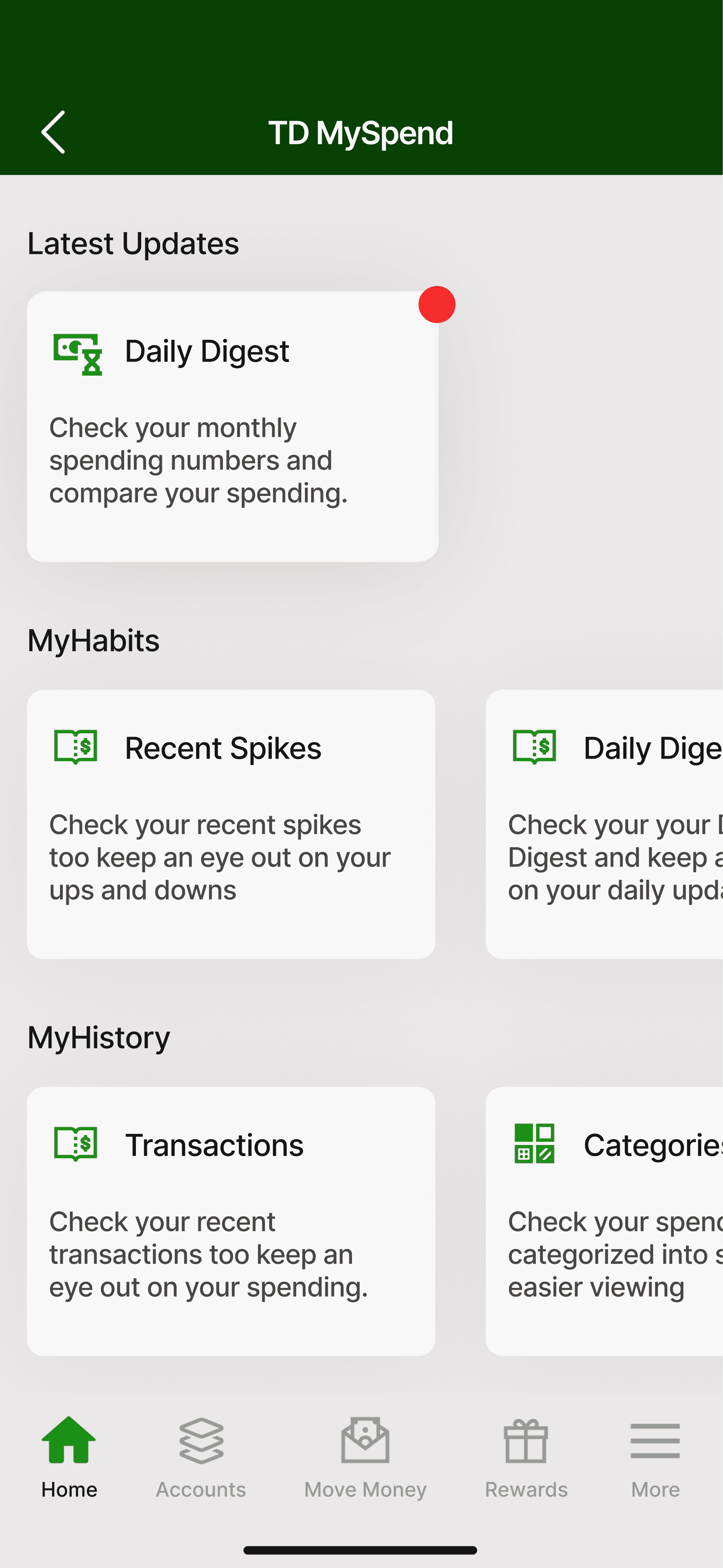
Step 2: Redesigning TD MySpend Dashboard
I started by analyzing the existing MySpend dashboard to identify the most critical usability issues. Breaking down the key problems helped prioritize what needed to be redesigned to create a clearer, more intuitive experience.
Issue 1: Unclear Names Without Descriptions
Why This Hurts User Experience:
Unclear labels increased cognitive load and made navigation harder, especially for users less familiar with financial apps.

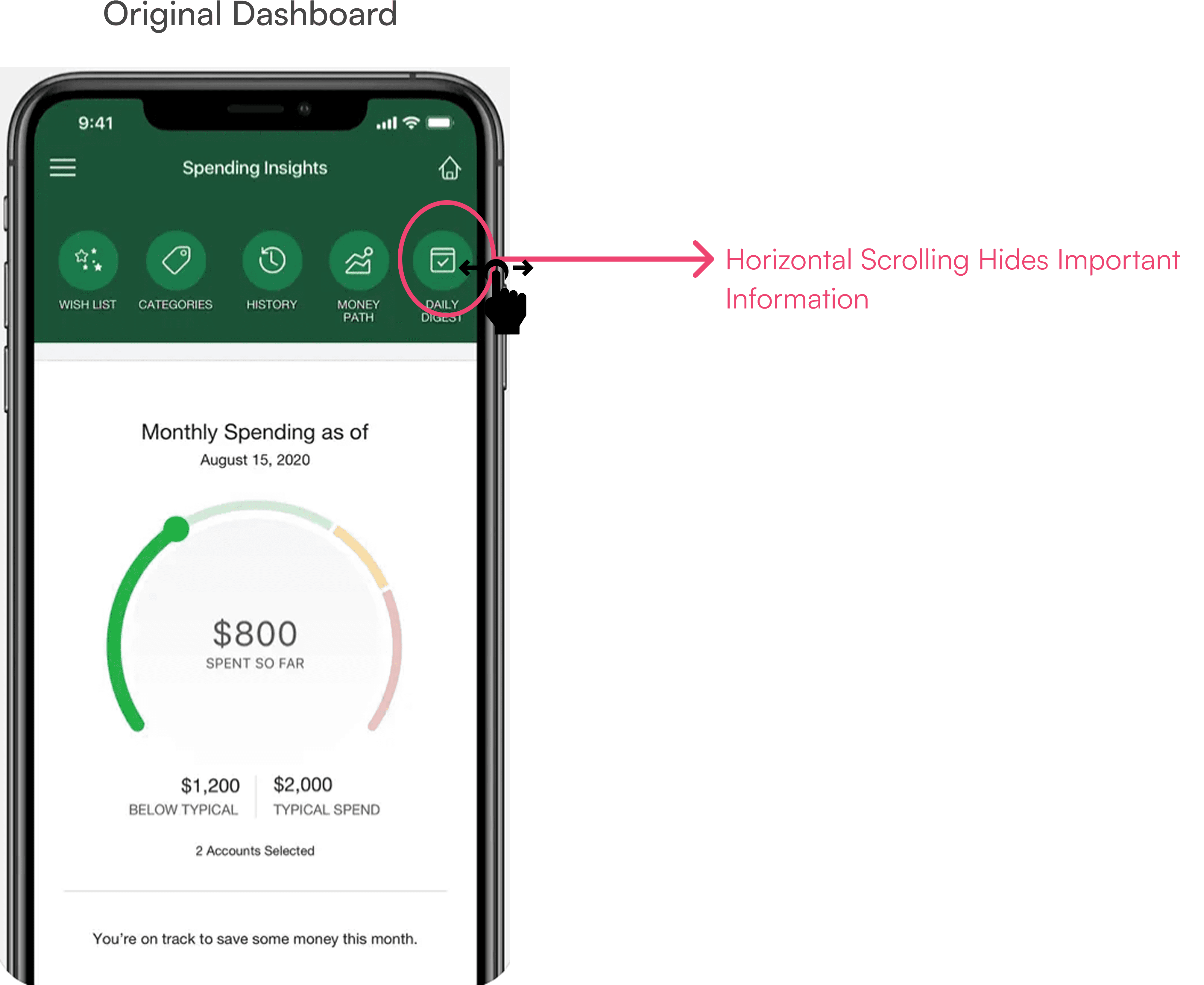
Issue 3: Horizontal Scrolling Hides Important Information
Why This Hurts User Experience:
Important categories were hidden behind horizontal scrolling, causing users to miss key information and increasing cognitive load. In financial apps, where clarity and trust are critical, non-standard navigation patterns create unnecessary risk and confusion.
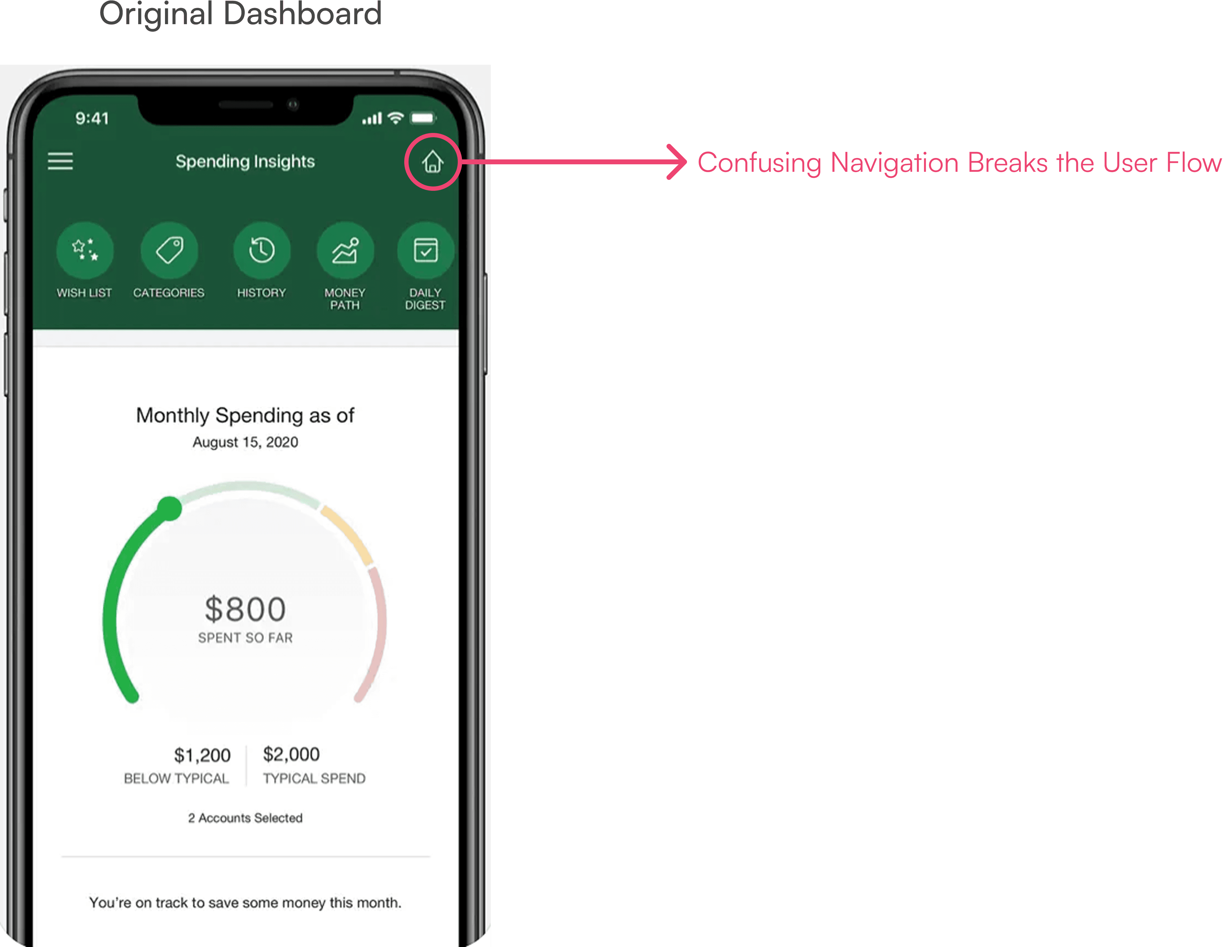
Issue 2: Confusing Navigation Breaks the User Flow
Why This Hurts User Experience:
The home button redirected users back to the main TD app instead of the MySpend dashboard, forcing users to switch apps and break their flow, adding unnecessary frustration.
Using early user feedback, I created a first redesign focused on improving navigation, organizing actions more clearly, and simplifying the dashboard experience.

Before
Improvement 1: Simplifying Navigation with a Clear Back Button
Removed the redundant home icon and replaced it with a simple back button, making it easier for users to return to the main TD app without confusion or app-switching friction.

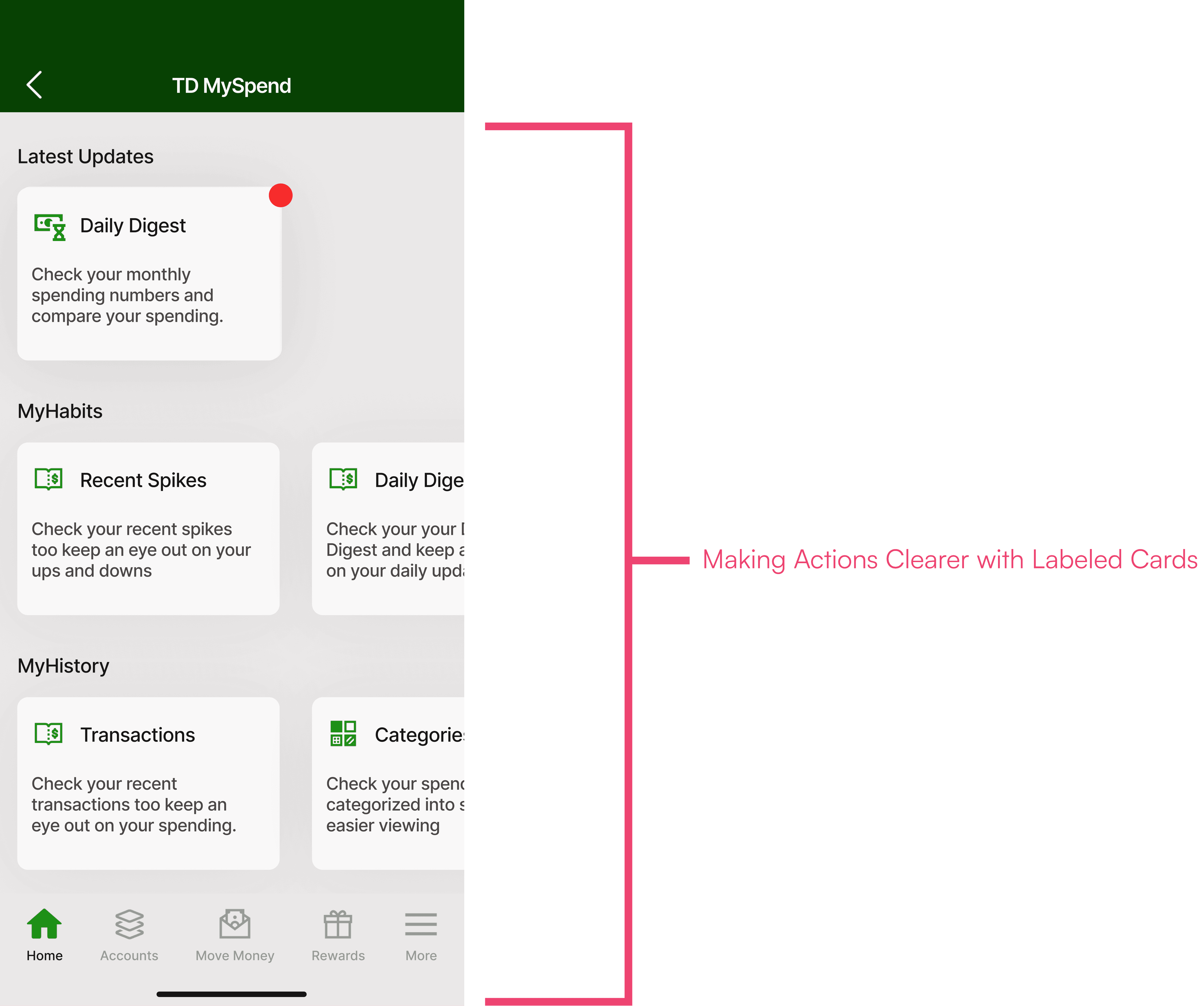
Improvement 2: Making Actions Clearer with Labeled Cards
Converted navigation options into individual cards with short descriptions, helping users quickly understand what each option does and reducing hesitation during decision-making.
Improvement 3: Grouping Features into Logical Categories for Better Organization
Organized related actions into clear groups like "My Habits" and "My History," improving the information architecture and helping users locate relevant features faster.

User Feedback on the Updated Design
I conducted usability testing with three participants, asking them to complete the same task of reaching the monthly spending summary screen using the updated design. Afterward, I collected feedback on any areas that still felt confusing or could be improved.
Usability Testing
3 usability testing sessions done remotely
I ran three remote usability sessions, measuring task time and click counts to evaluate the updated experience and identify remaining areas for improvement.
User Interviews
3 user interviews done remotely
I asked users targeted questions to identify any parts of the experience they found confusing or felt could be improved.
Usability Testing Results With Iterated Design
The findings below summarize the key insights gathered from usability testing sessions, highlighting areas where users still experienced confusion and opportunities to further improve the updated experience.
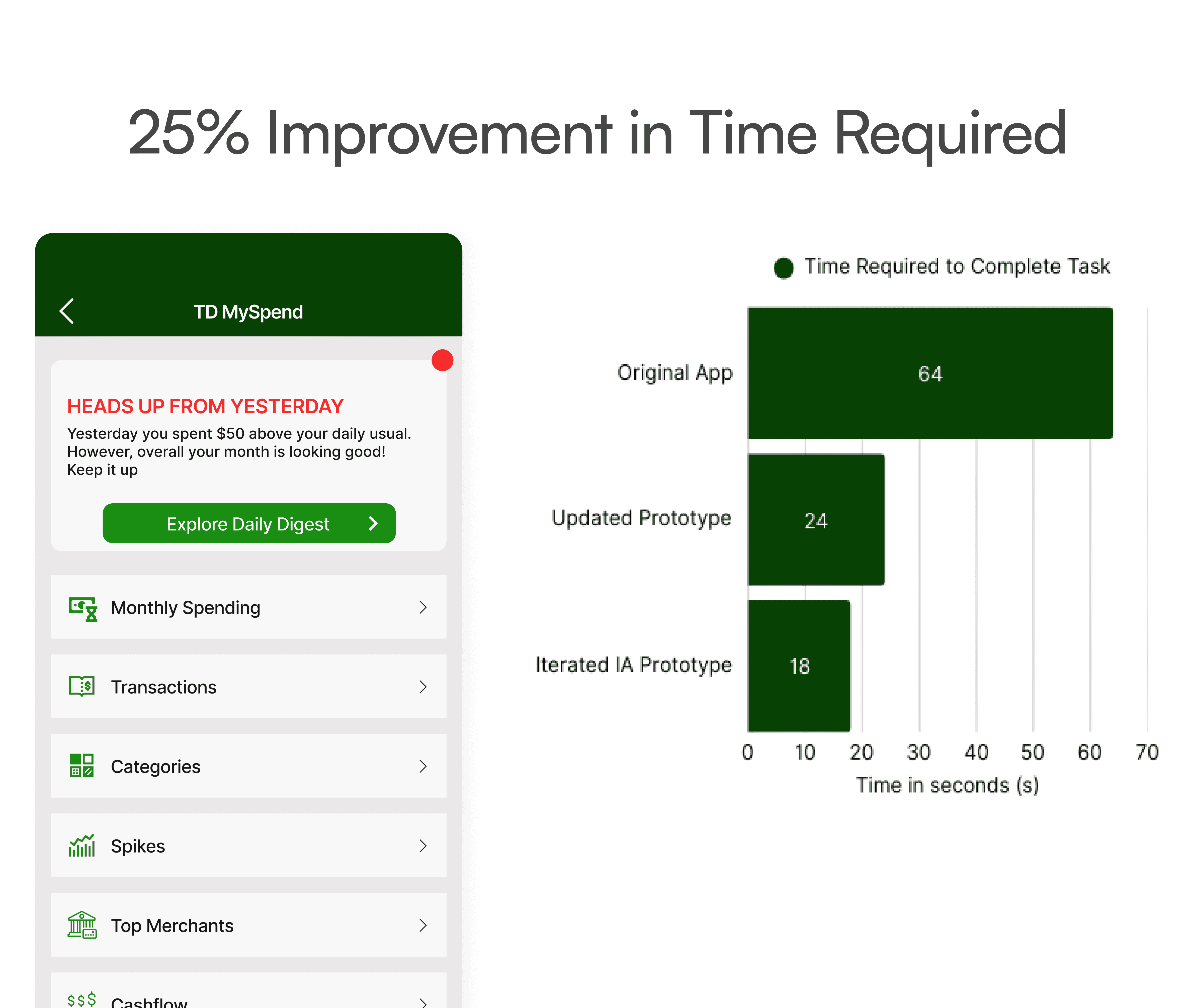
On average, it took users 24 seconds to complete the task. on the updated design.
After the redesign, users completed the task in an average of 24 seconds, down from 1 minute and 4 seconds in the original flow (62.5% Improvement).

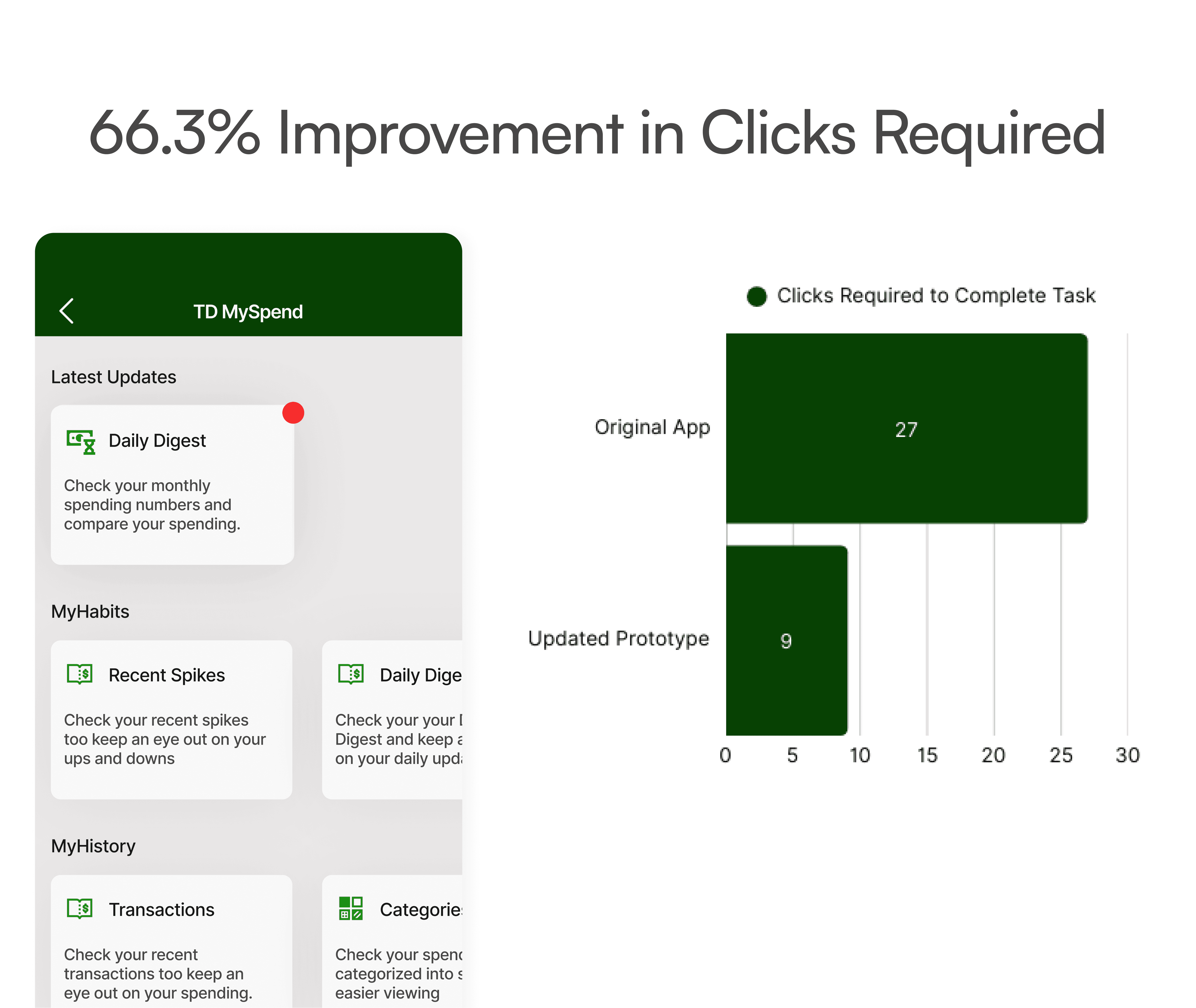
On average, users needed 9.1 clicks to complete the task on the updated design.
After the redesign, users completed the task in an average of 9.1 clicks, down from 27 clicks in the original flow (66.3% Improvement).
Horizontal Scrolling Felt Unprofessional and Out of Place
2/3 Participants felt the horizontal scroll made the screen look unprofessional and inconsistent with the rest of the TD app. They expected a more standard vertical layout for easier navigation.

Before

Improvement: Shifting from Horizontal Scroll to Vertical Navigation
After 2 out of 3 participants preferred vertical navigation, I replaced the horizontal scroll to better meet user needs and reduce friction during navigation.

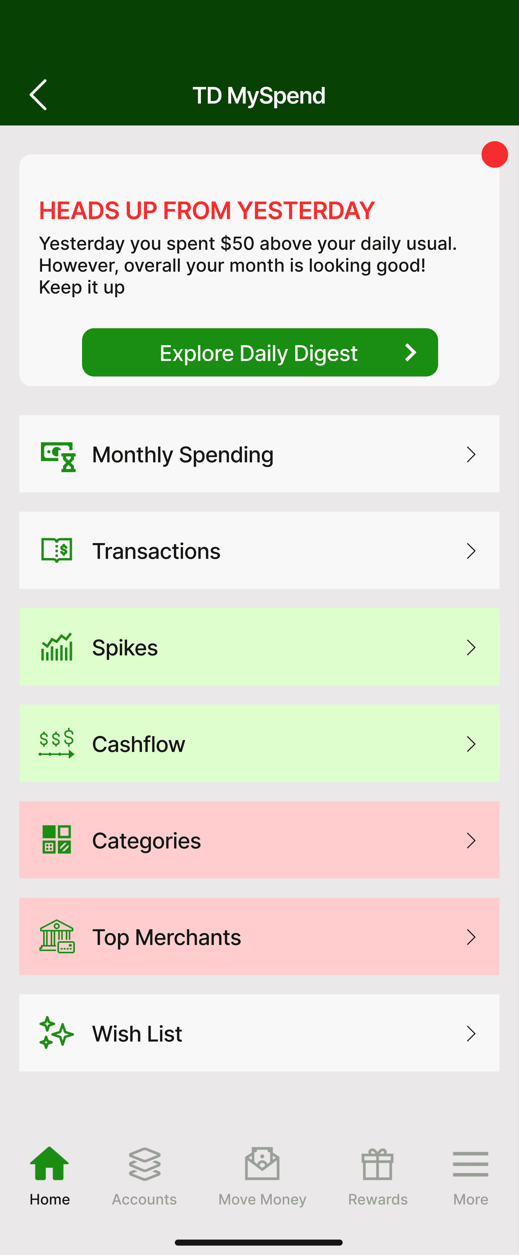
Step 3: Improving Information Architecture Through Card Sorting
To make the dashboard easier to navigate, I conducted a card sorting study using UXtweak. Based on user input, I reorganized and grouped actions, placing the most important features at the top and reducing cognitive load.
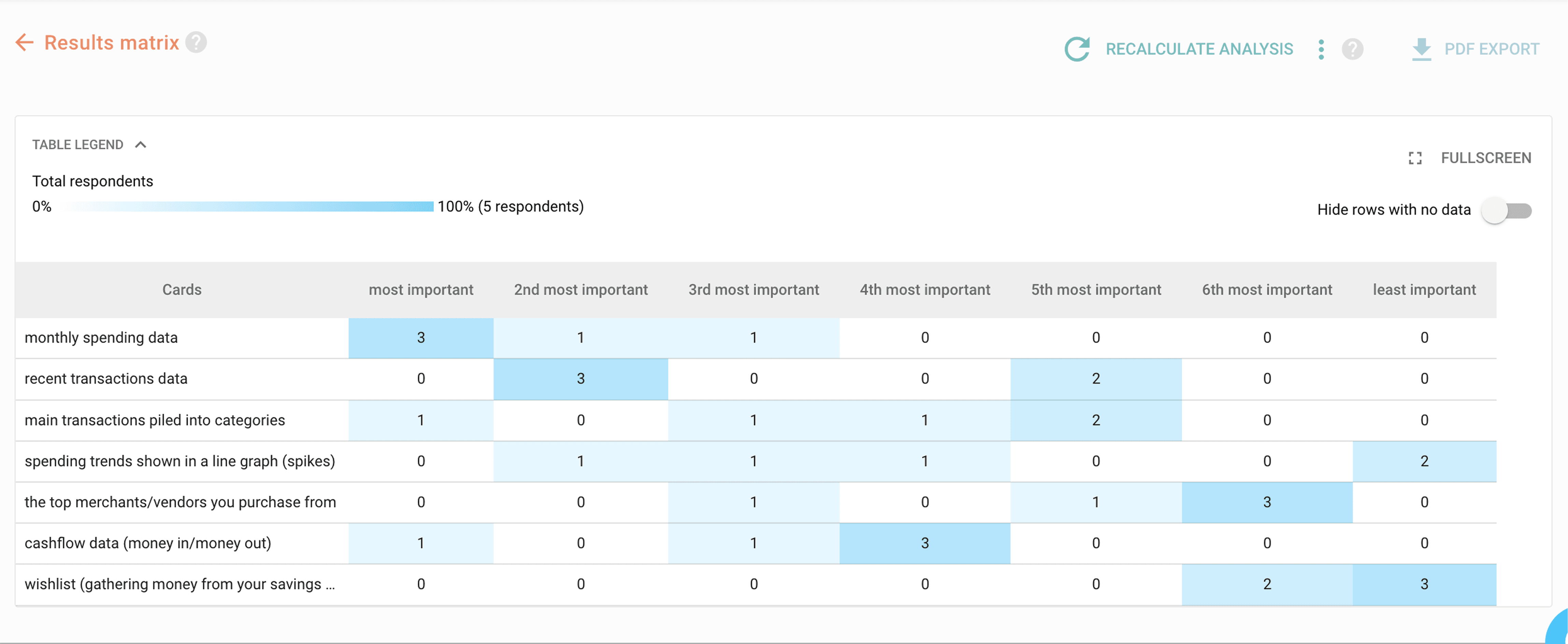

Previous IA

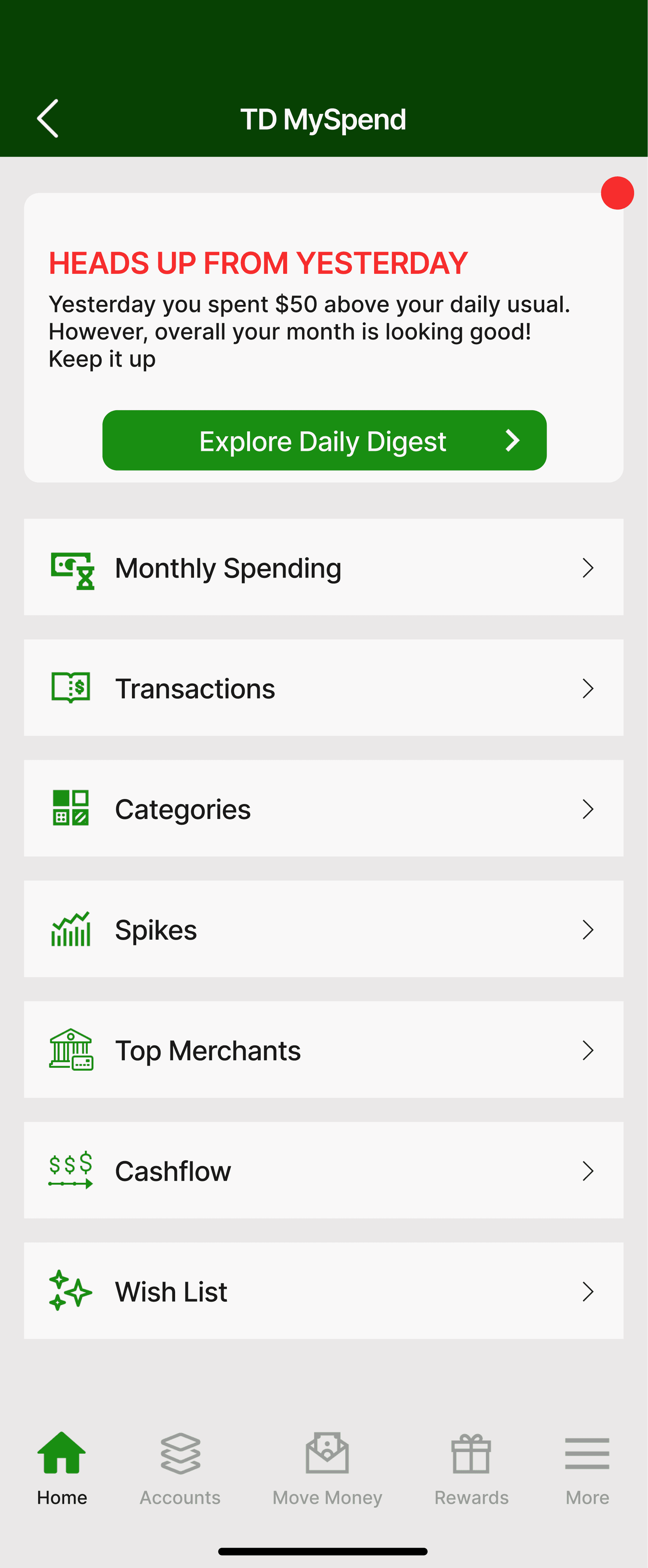
Previous IA
Validating the Improved Experience Through Usability Testing
After implementing information architecture improvements based on UXtweak card sorting results, I conducted a second round of usability testing. The updated design showed clear improvements in navigation, clarity, and user confidence when accessing key spending insights.
On average, it took users 18 seconds to complete the task after the updated IA changes
Streamlined navigation and a clearer dashboard structure helped users complete the task faster compared to earlier versions.
On average, it took users 8 clicks to complete the task after the updated IA changes
Improvements to the information architecture reduced unnecessary steps, helping users complete the task with fewer clicks and less effort.

All 3 out of 3 participants were satisfied with the updated experience
All three participants found the updated design easier and faster to use, confirming that the changes directly addressed the core user pain points I focused on solving.

Did the redesigned MySpend experience make spending insights easier to access and understand?
Safe to say IT DID! — and here’s the data to back it up
Compatibility Score
Task Completion Time Improved by 71%
Average task time dropped from 1 minute 4 seconds to just 18 seconds after the redesign, making it significantly faster for users to reach their spending summary.
Review System
Clicks Required To Complete Task Reduced by 72%
The number of clicks needed to complete the task decreased from 27 clicks to 8 clicks, streamlining the path to key financial insights.
Expert Feedback
100% of Participants Found the New Design Easy to Use
All 3 out of 3 participants said the updated design was easier to navigate, with clearer organization and faster access to important information.
Next Steps for a Stronger User Experience
If I had more time, this is where I would push the design even further to create a stronger user experience:
Improving Data Visualization
This redesign focused on fixing the information architecture and removing navigation barriers. If I had more time, I would dive deeper into improving how MySpend’s financial insights are visualized to help users understand their spending faster and more clearly.

Key Takeaways
Improving navigation and simplifying access had the biggest impact on the MySpend experience. Small adjustments like clearer labels and better grouping made the product feel faster and more intuitive without needing a complete overhaul. Listening to users early made it easier to prioritize what actually mattered, not what just looked good on paper.