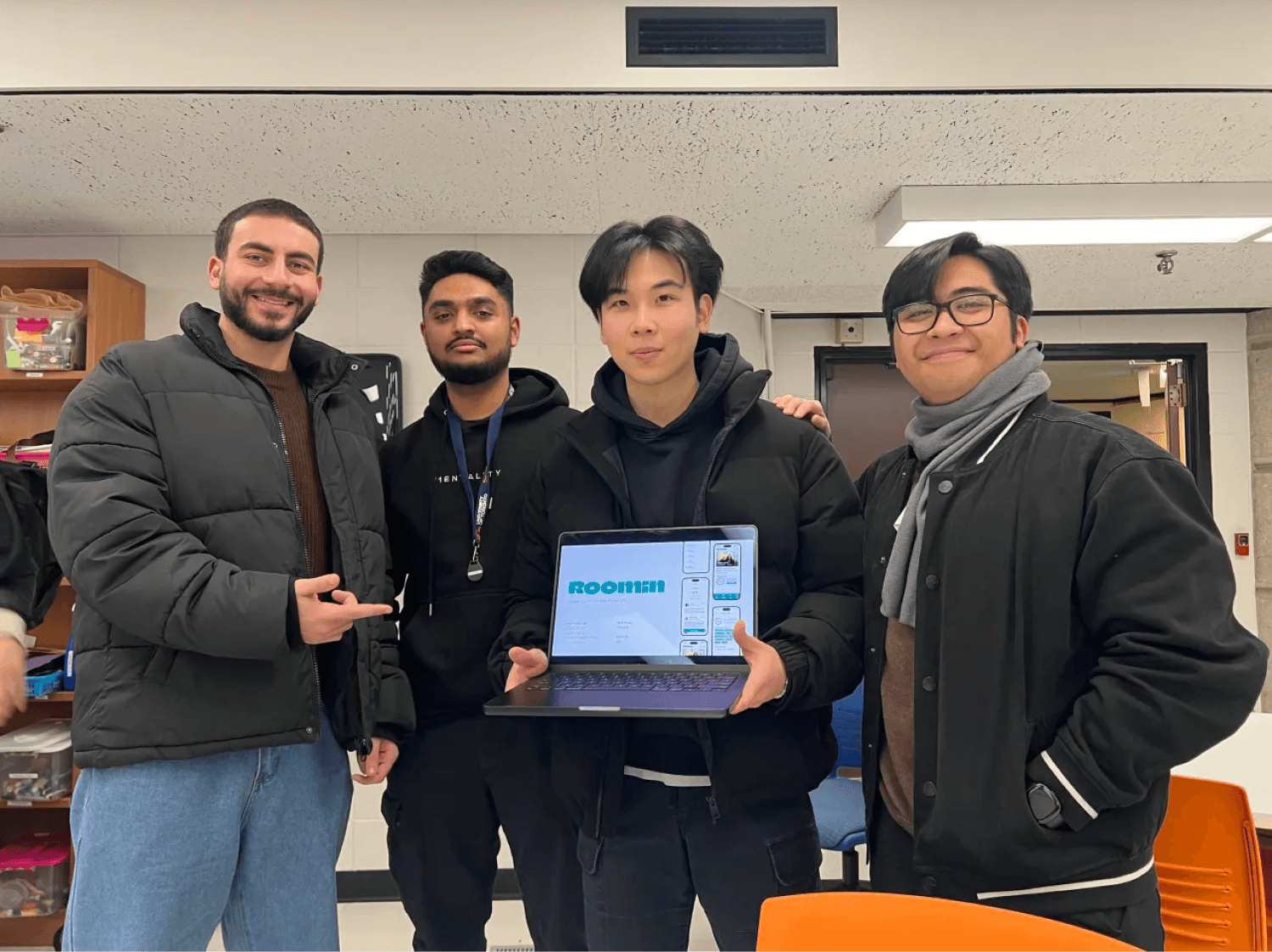
Roomin
Roomin is an app that simplifies the process of finding roommates by promoting transparency and building trust among users.

tl:dr 🙂 (Here's a summary of the project if you're short on time.)
Context 👨🏽💻:
Roomin is a 12-week capstone project from our Master's program at the University of Toronto. As the UX Design and Strategy lead in a team of four, I ensured a user-first approach throughout the project. The app addresses key challenges in the roommate search process—trust and transparency—by offering features like user verification, smarter matching, and advanced lifestyle filters.
Role 😎:
As the UX designer in a team of four, I led research, shaped strategy, and ensured every design decision was grounded in user needs.
Key Insights 🎯:
87% of users were worried about trusting roommates on competitor apps.
75% of users wanted a verification system.
63% of users wanted an easier way to find roommates.
75% of users wanted advanced lifestyle filters.
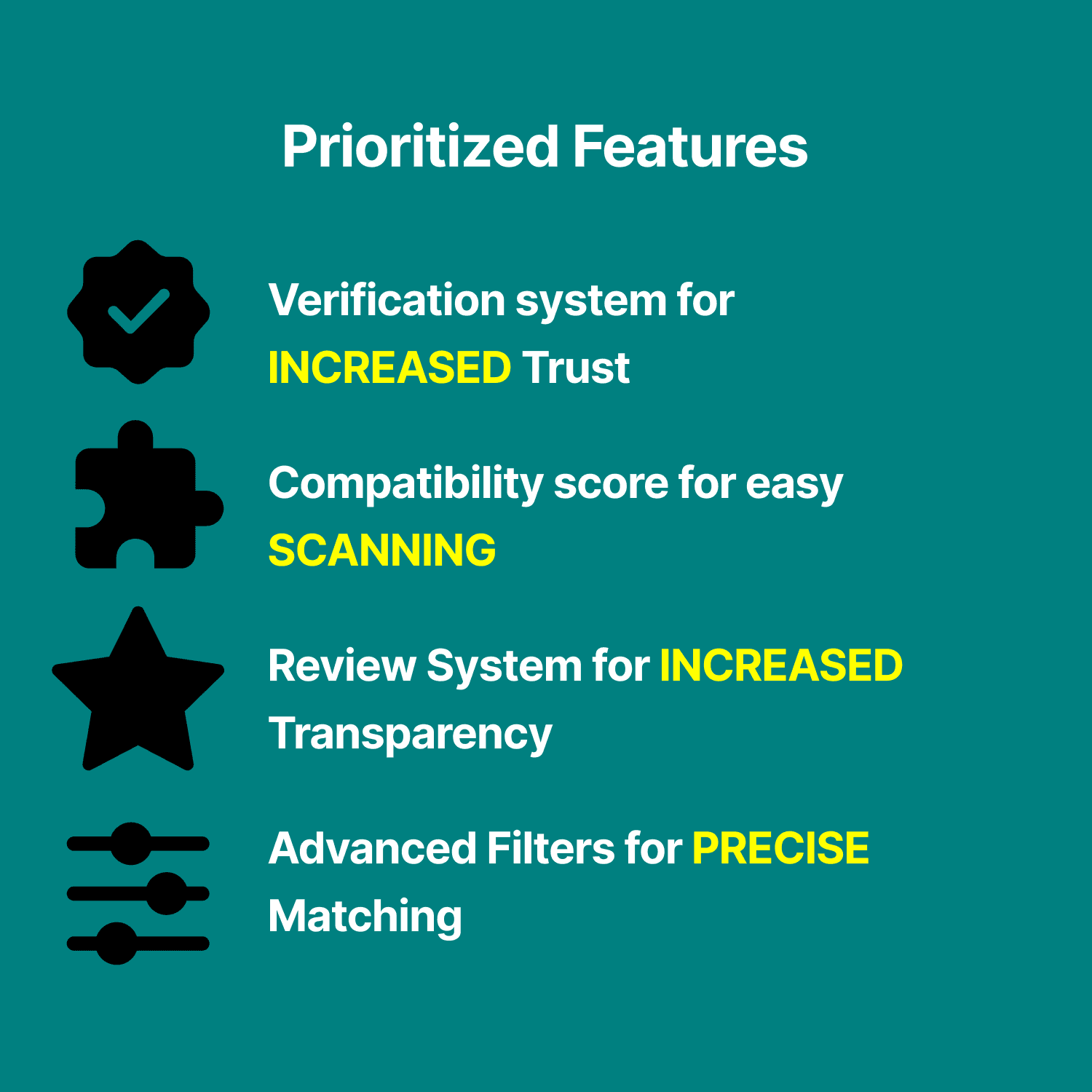
Key Designed Features 🧩:
To improve trust and transparency in roommate searches, we focused on four core features:
Compatibility Score – Quickly scan profiles based on lifestyle and preferences.
Advanced Filters – Get better matches with personalized search options.
Review System – Increase transparency with user-generated feedback.
Verification System – Build trust through verified profiles.
These features were strategically selected based on thorough user research, thematic analysis, and a SWOT analysis—ensuring the app delivers meaningful impact from day one.
Results 📈:
6/6 experts found our design intuitive & easy to use.
5/6 experts agreed our solutions improved trust and transparency, but suggested refining the rating system to reduce bias and complexity.
Features such as the Compatibility Score were highly favoured, with 100% of users considering it a valuable addition to streamline the roommate search process.
Overview
Roomin is an app my team and I developed as part of our Master's capstone project. It simplifies the process of finding roommates and stands out from the competition by prioritizing trust and transparency through key user-focused features.
Role
UX Designer
Duration
Sep 2024 - Dec 2024 (4 months - University Capstone Project)
Test frfr
Understanding The Problem
To understand the problem, my team and I conducted primary research through user interviews with students and working individuals who are currently renting. We also conducted secondary research by reviewing articles, blog posts, user reviews, and videos to gain deeper insight into the challenges people face when searching for roommates.
My research encompassed:
3 user interviews to understanding the user goals and needs
6 Secondary sources reviewed to find common user complaints
Uncovering pain points with the existing user journey by reviewing apps and articles
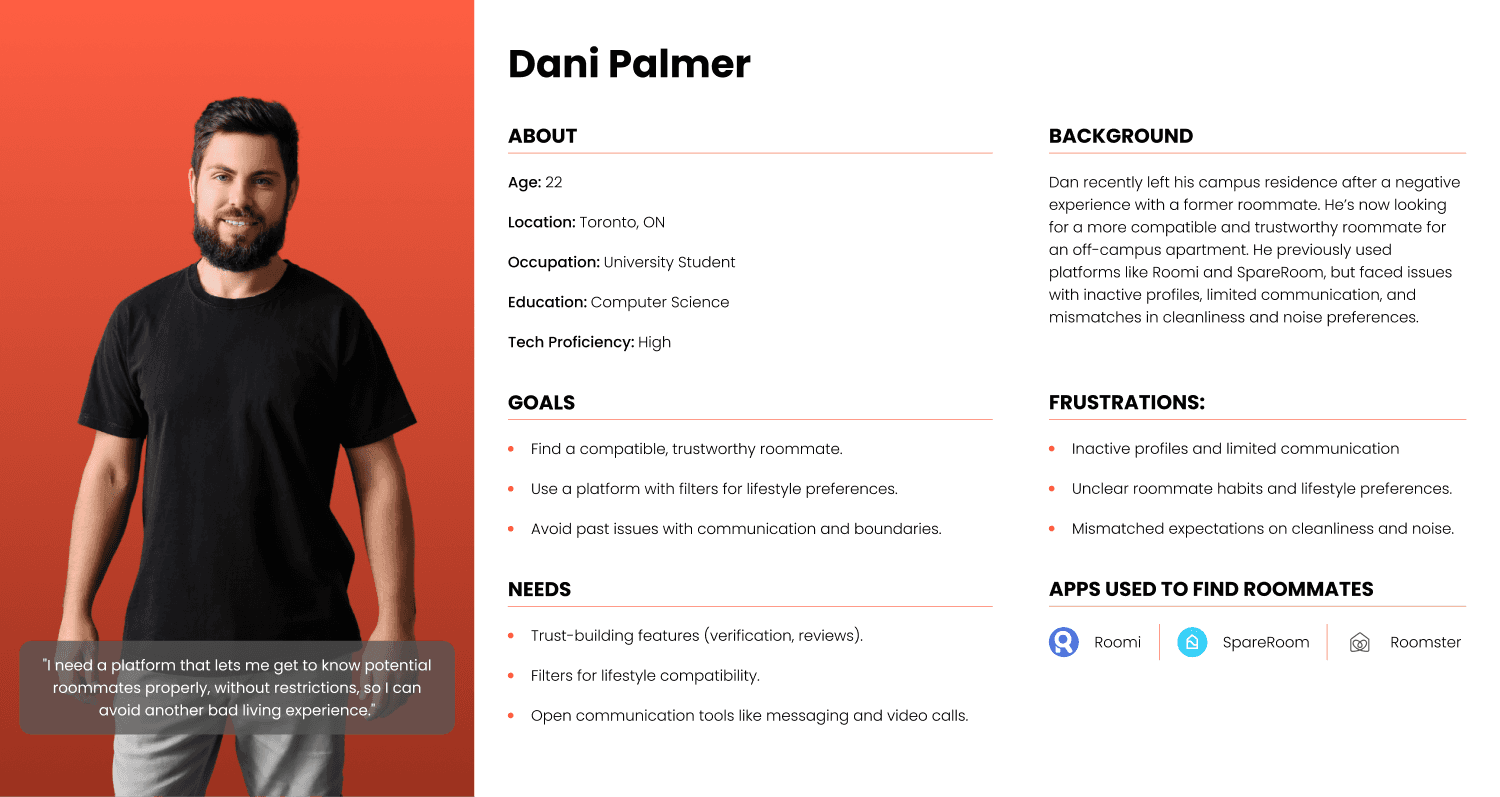
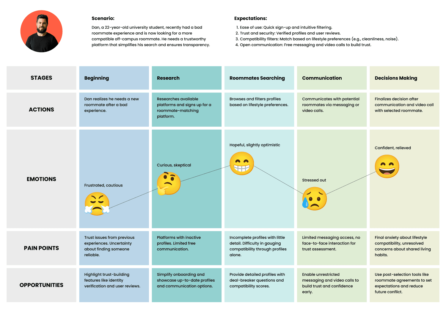
Getting to Know Our Users
After conducting thorough primary and secondary research, our team developed a detailed user persona and user journey map to better understand our target audience. These deliverables were key to uncovering the motivations, challenges, and emotions of our primary users. The process revealed critical insights into how users currently navigate the roommate search journey, highlighting key pain points and opportunities for improvement. By visualizing their experience, we were able to align our design approach with real user needs. These tools served as a foundation for the next steps, ensuring every design decision was intuitive, user-centric, and impactful.
User Persona
User Journey
Gathering Insights
After collecting the recordings from our user interviews, I collaborated with my teammates to conduct affinity mapping and synthesize the pain points we identified. We organized these insights into common themes, which directly informed the key features of the platform.
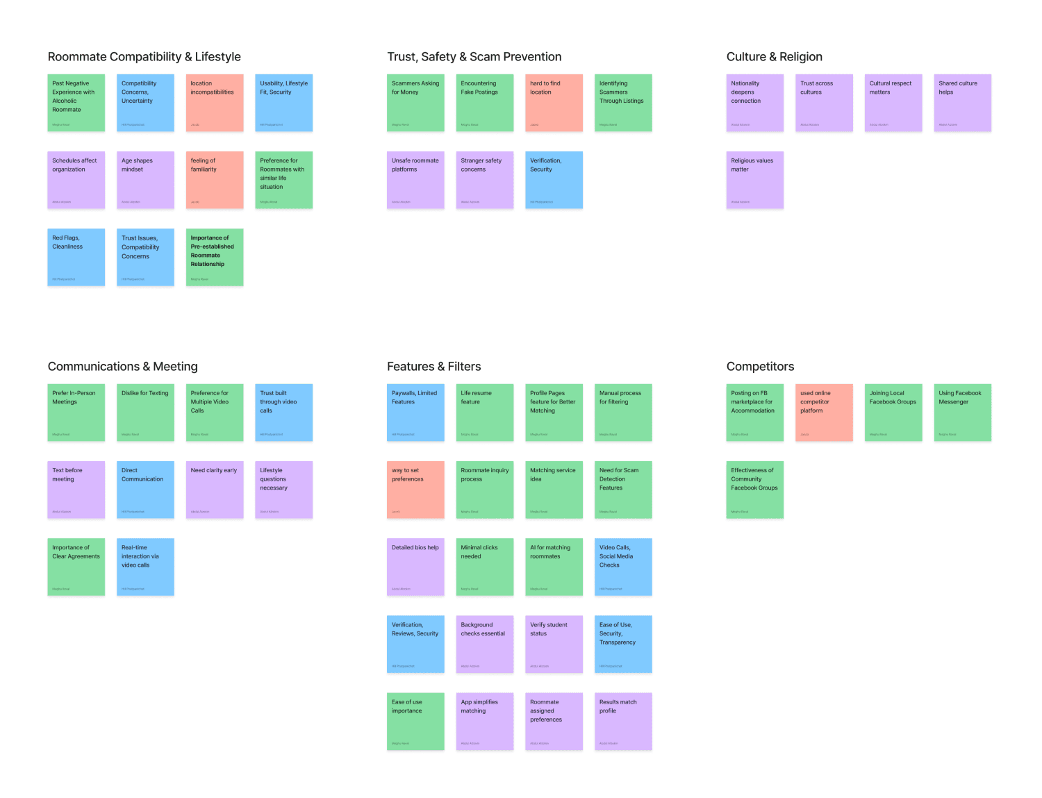
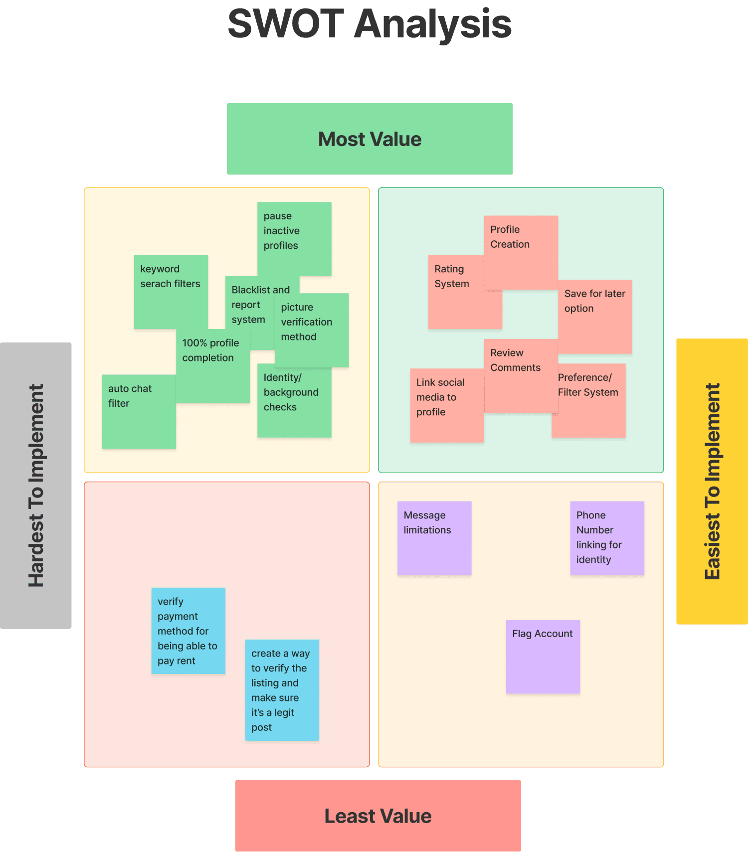
Prioritization Of Features
After organizing the common themes, we conducted a SWOT analysis to identify which features made the most sense for our initial launch. We prioritized features that offered the highest value to users while requiring the least effort to implement, ensuring a strategic and efficient starting point for the product.
Narrowing Down The Scope Of Work
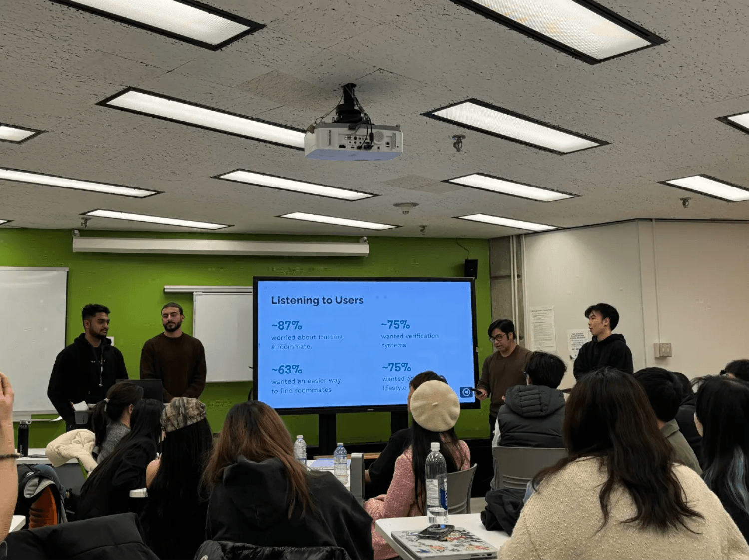
Based on the user interviews conducted with 12 users on the existing Audience wizard, we found the following key issues:
87% of users were worried about trusting a roommate in competitor apps.
75% of users wanted a verification system in place
63% of users wanted an easier way to find roommates
75% of users wanted advanced lifestyle filters
Wireframing the Solution
Based on the above problems identified, I worked towards addressing these pains by coming up with potential solutions:
Compatibility score: Clearly show how well you align with potential roommates.
Learn about your compatibility: Easily understand why you’re a good fit.
Share honest reviews: Build trust with real feedback from others.
Feel at home right away: Simple navigation that puts everything at your fingertips.
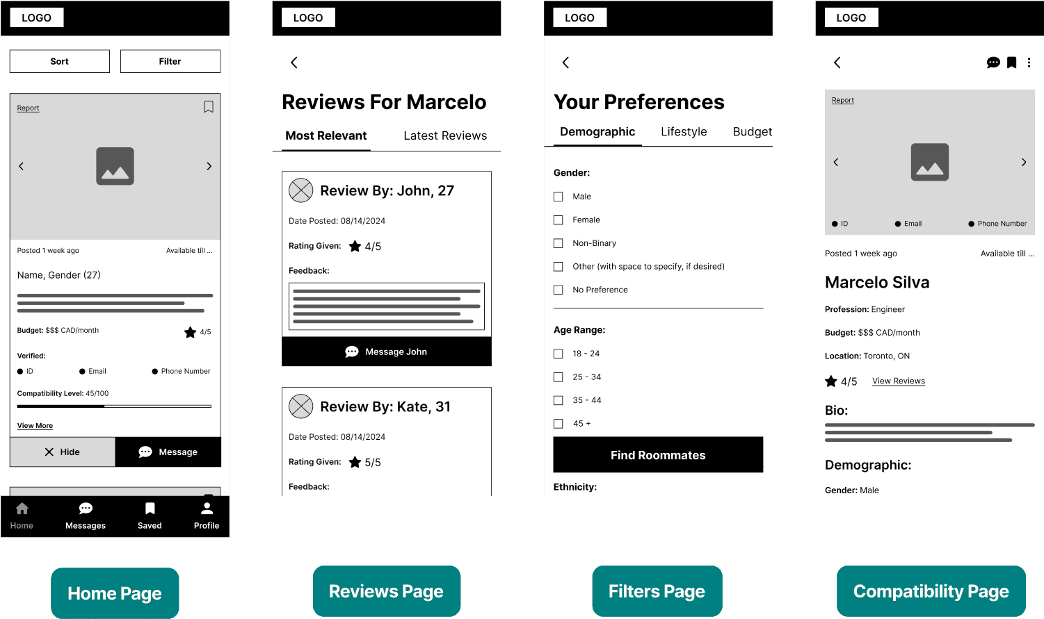
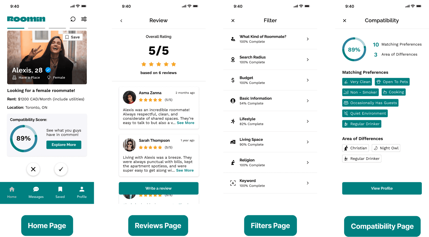
I quickly created basic wireframes to gather feedback from professors, industry experts, and users on the overall layout and structure of our four key screens: Home Page, Compatibility Page, Review Page, and Filter Page.
Validating the Design
I conducted usability testing sessions along with a 5-second test to evaluate the effectiveness of our wireframes and uncover areas for improvement. For the usability test, I designed a "happy path" scenario in which users navigated from the home screen, set their filters and preferences, and returned to the homepage.
The 5-second test provided insight into users’ first impressions of the home screen, while the usability test revealed deeper issues around navigation and task completion. Key findings included:
Overwhelming home screen: Users felt there was too much information, making it difficult to focus on key details.
Hard-to-find filter preferences: Filters were not easily accessible, frustrating users trying to set their preferences.
Lack of content prioritization: Users wanted the home screen to highlight the most important information clearly.
Clunky task flow: While users could complete the happy path, the experience felt unintuitive due to poor content organization.
These insights highlighted the need to simplify the home screen, enhance filter visibility, and improve information hierarchy to create a smoother, more user-friendly experience.
Developing The Designs
My team and I collaborated to create a high-fidelity prototype, incorporating key feedback from our usability testing sessions. We focused on enhancing usability while ensuring the design aligned with our core goals of building trust and promoting transparency throughout the user experience.
Key design updates included:
Visibility of compatibility score: We placed the compatibility score prominently to help users easily assess potential matches.
Intuitive filter button: A simple, recognizable filter icon was added at the top right for easy access.
Explore more CTA button: We introduced a clear call-to-action to let users quickly access profiles of interest.
Progressive disclosure: Filters were hidden under dropdown menus to reduce clutter and present only essential information.
These updates were designed to create a more intuitive and user-friendly experience, ensuring the interface felt seamless and aligned with user needs.
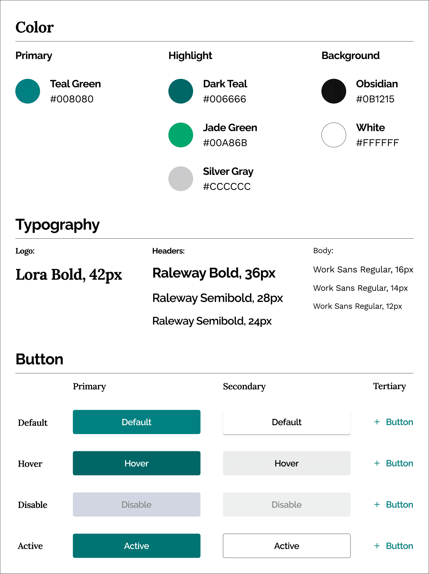
Design System
To support the new prototype, I developed a design system to ensure visual consistency and clarity across the app. It included a cohesive color palette, standardized typography, and reusable button components—designed to enhance usability and create a seamless, unified user experience.
Refining the Prototype
After completing our high-fidelity prototype, my team presented the case study to our class and a panel of industry experts. Their feedback revealed a critical flaw: the rating system could introduce unnecessary bias, which conflicted with our app’s core goals of trust and simplicity.
In response, we decided to remove the rating system entirely and reworked the design to support a more neutral and straightforward user experience. This change aligned closely with our vision of building a transparent and unbiased platform for users.
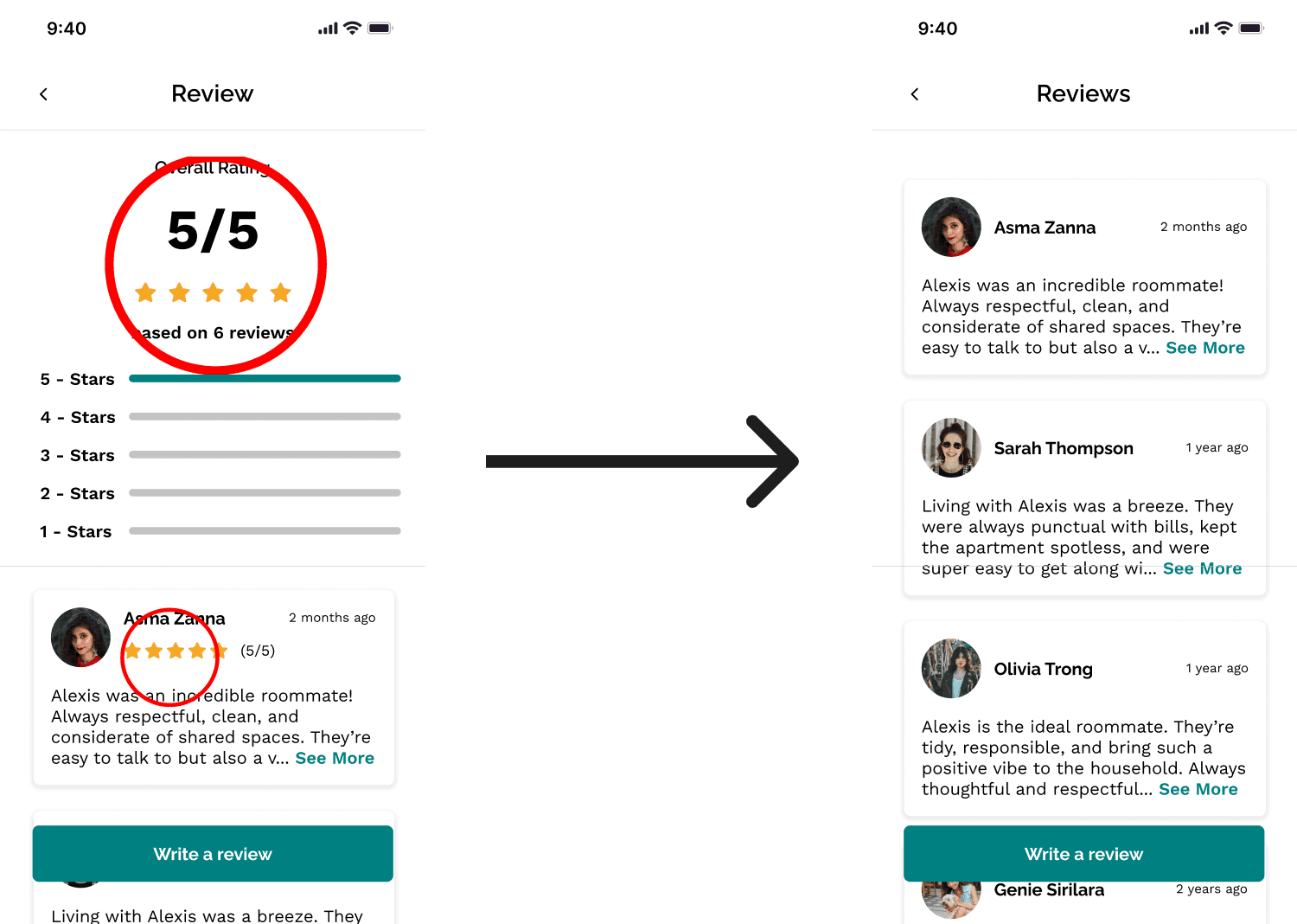
Removed Ratings from Home Page
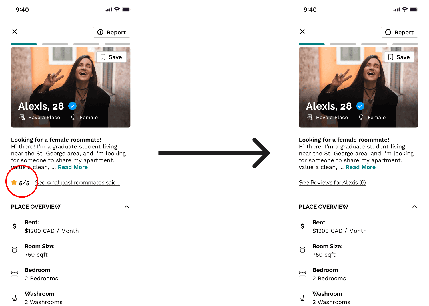
Removed Ratings from Reviews Page
Results and Lessons Learned.
Results
90% Users felt the app was intuitive and easy to understand/use.
The Compatibility Score was a great hit as 100% of users thought it was a great idea to streamline their process of finding a roommate.
Learnings
Prioritizing core user needs, the rating system was important but through testing, we had to remove it due to the feature’s increasing complexity.
Focusing on a concise design, in our initial design we had an infinite scroll homepage, but from user testing, we adopted a “dating app” look for the design to increase familiarity and increase the overall experience.
Decrease information overload, in our initial design we had a very long and tedious design for our preferences page, we fixed this by adding dropdown menus, so users ca choose what they want to see.