TD MySpend
I integrated TD MySpend directly into the app, improving the user experience by reducing clicks and task completion time by 70%
Overview
TD My Spend is an app that allows users to check their spending insights and improve their spending habits. My design aims to improve this design further by making it more user-friendly.
Role
UX Designer/Researcher (Solo Project)
Duration
Jul 2024 – Sep 2024
Test frfr
Understanding The Problem
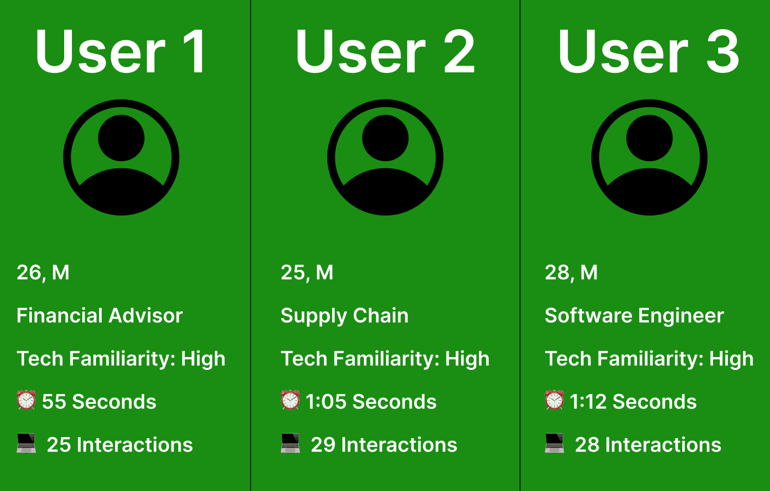
To gain a deeper understanding of the issues users face with TD MySpend, I conducted interviews with three TD customers. Each participant completed a task while I measured two key metrics:
The number of clicks and interactions needed to complete the task.
The amount of time taken to complete the task.
Additionally, I analyzed user reviews and ratings from Reddit, the Play Store, and the App Store. This helped me identify recurring issues and validate that the problems were common among a broader user base. This research provided valuable insights into user pain points and set the foundation for the design process.
Overview
TD My Spend is an app that allows users to check their spending insights and improve their spending habits. My design aims to improve this design further by making it more user-friendly.
Role
UX Designer/Researcher (Solo Project)
Duration
Jul 2024 – Sep 2024
Gathering Insights
From the usability testing and studying the secondary research, I uncovered several key insights:
Metrics: On average, users needed 27 clicks and interactions to complete the task, taking 1:04 seconds overall.
Common Complaints:
The app is too glitchy, causing interruptions during task completion.
Users were often confused about where to click, struggling with navigation.
There were too many options to select from, leading to information overload.
These findings highlighted significant usability challenges and informed the direction for design improvements.
Understanding the User
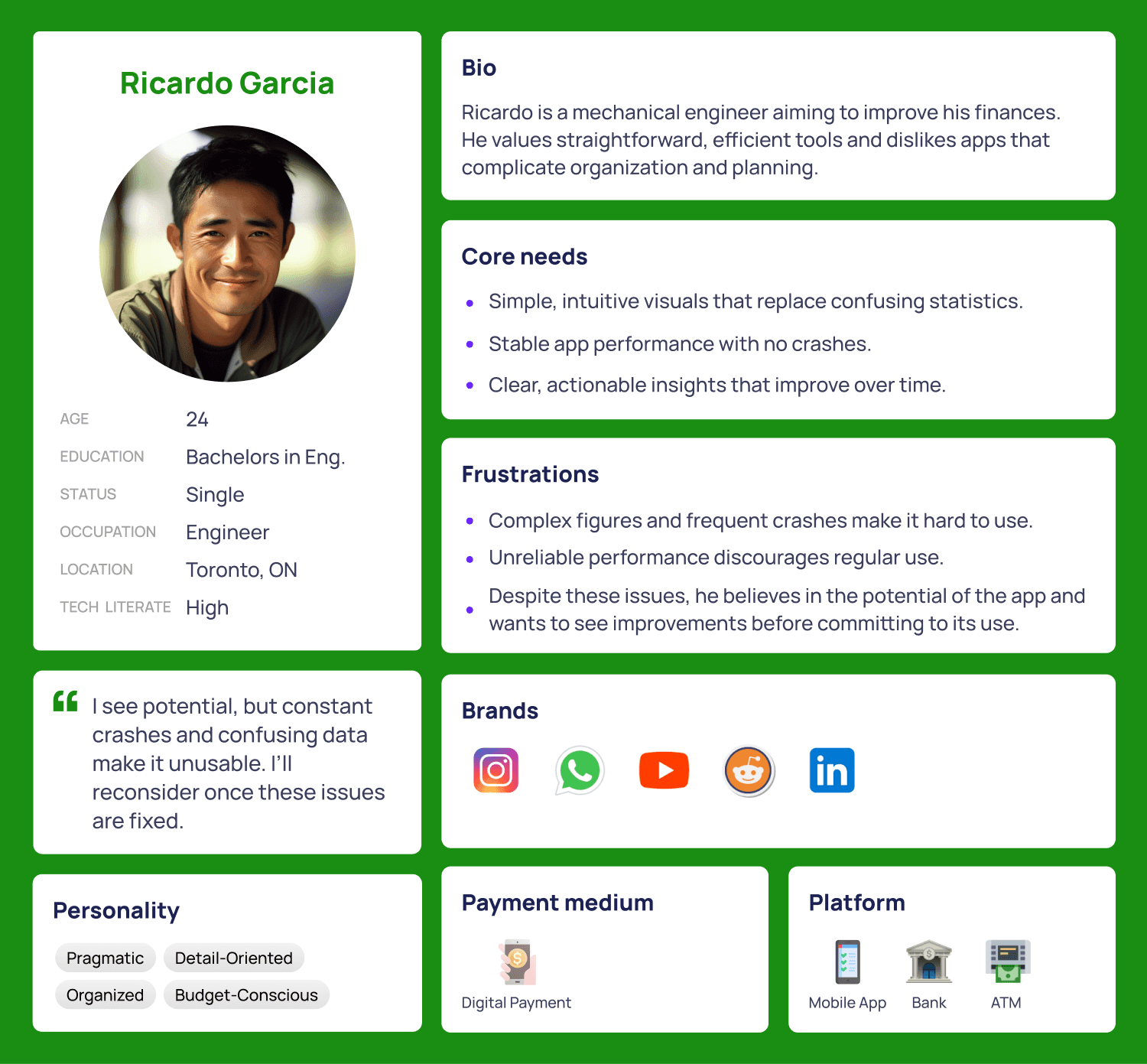
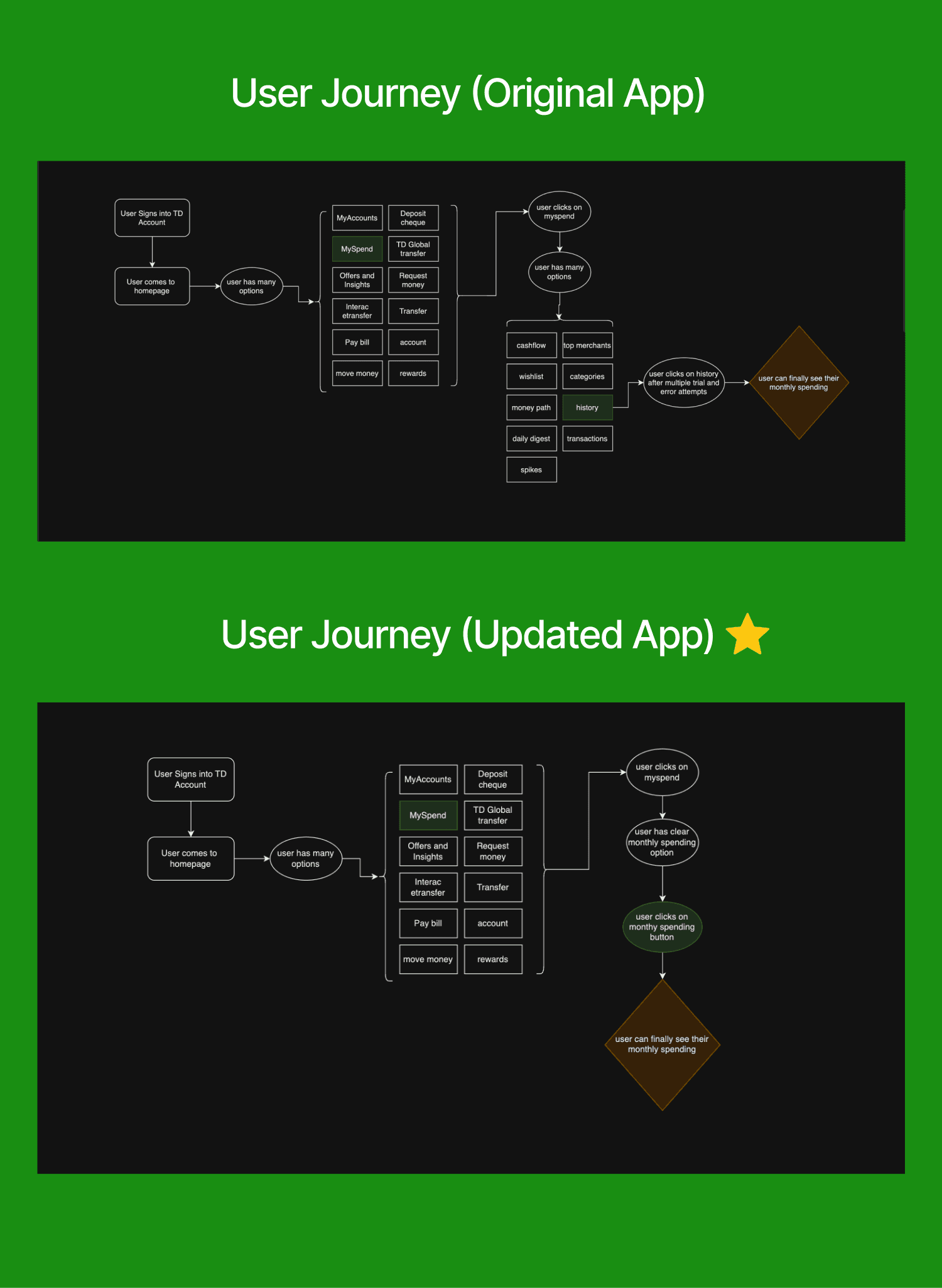
Building on insights from usability testing and secondary research, I created a user persona and a user journey map to better understand the target users. The persona captured key goals and frustrations, while the journey map identified critical pain points and opportunities for improvement. These tools guided the design process, ensuring the final solution addressed real user needs and pain points.
User Persona:
All user personas were created based on insights gathered from user interviews and usability testing. These personas do not represent all MySpend users, but rather reflect the key demographics observed during the interviews and initial testing phase.
User Journey Map:
Prototyping The Solution
In this phase, I focused on addressing the key usability issues identified during research by implementing the following design changes:
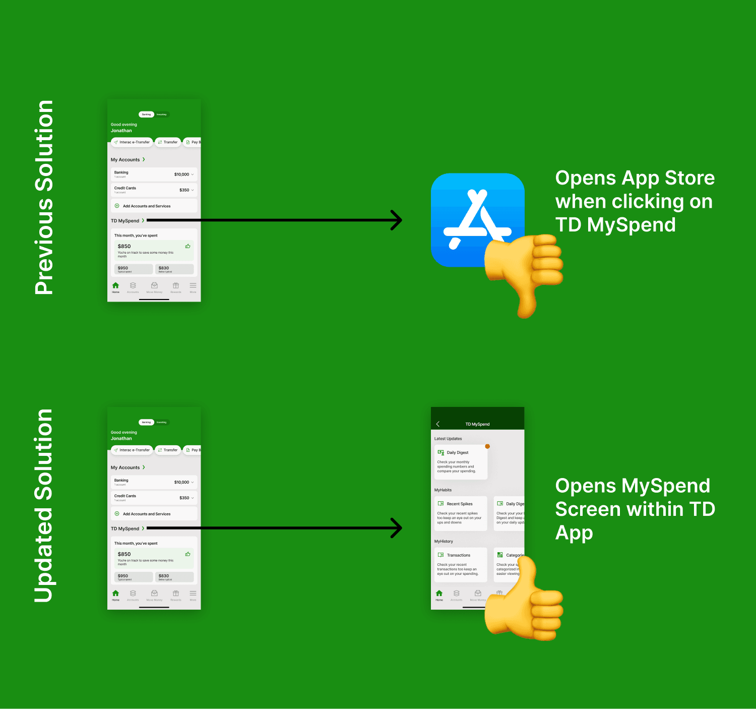
Integration: Instead of having TD MySpend as a separate app, I incorporated its functionality directly into the main TD app. This created a seamless experience, reducing glitches and making it easier for users to access spending insights.
Horizontal Card Layout: I reorganized the information into a horizontal card format, simplifying navigation and allowing users to quickly find what they need without feeling overwhelmed.
These changes aimed to enhance usability, minimize confusion, and create a more intuitive user experience.
Getting Feedback
In this phase, I tested the updated prototype with three new users and gathered their feedback. The insights were as follows:
Positive Feedback: Users appreciated the seamless integration of TD MySpend into the main TD app, eliminating the need to open a separate app. They found it easy and intuitive to access the monthly spending screen.
Areas for Improvement: While the app was generally well-received, the horizontal card design was criticized for appearing "unprofessional."
To measure the impact of the design changes, I tested the same metrics as before and found significant improvements:
Clicks and Interactions: The average number of clicks and interactions dropped to 9, marking a 66.8% improvement from the original TD app.
Time to Complete Task: Task completion time decreased to 24 seconds, which is a 62.5% improvement compared to the previous 1:04.
These results validated that the design changes contributed to a more efficient and user-friendly experience.

Updating the Designs
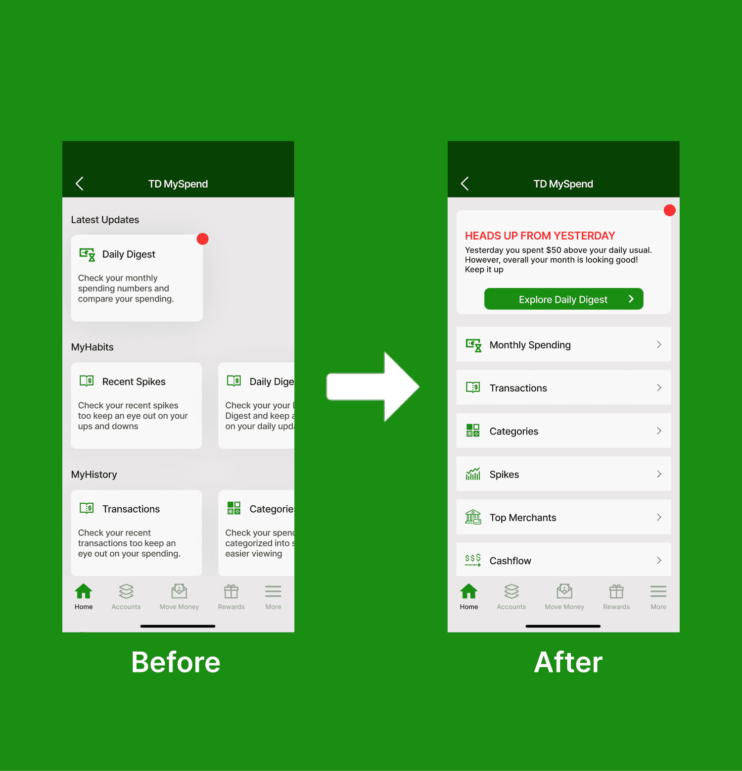
In this phase, I refined the design to enhance consistency and improve the user experience. Taking inspiration from the rest of the TD app, I replaced the horizontal card design with a more familiar flat card layout. This change was intended to align better with the existing design language of the app and ensure a smoother user flow.
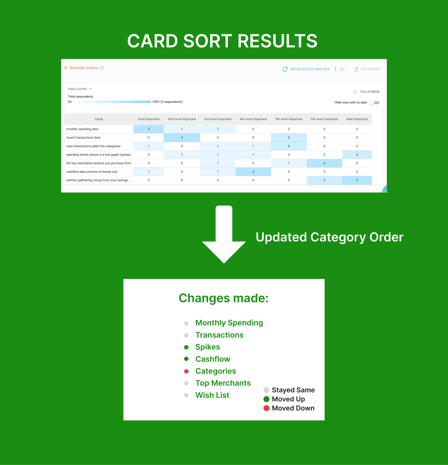
Additionally, I conducted a card sorting test to help prioritize the cards based on user preferences, organizing them from most to least important. This allowed for a more intuitive and logical order, ensuring that key information was more easily accessible to users.
These updates aimed to improve familiarity, usability, and the overall visual cohesion of the app.
Update #1: Converting Horizontal Cards into Flat Cards:
Update #2: Card Sorting to Organize Categories:
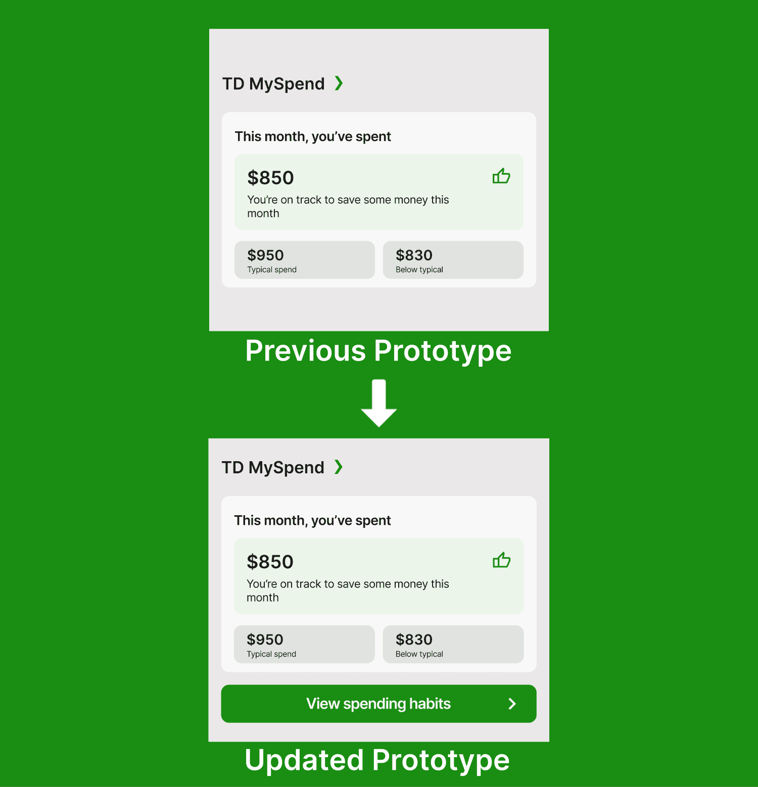
Update #3: Added "View Spending Habits" CTA to Reduce Confusion:
Impact of Updated Designs
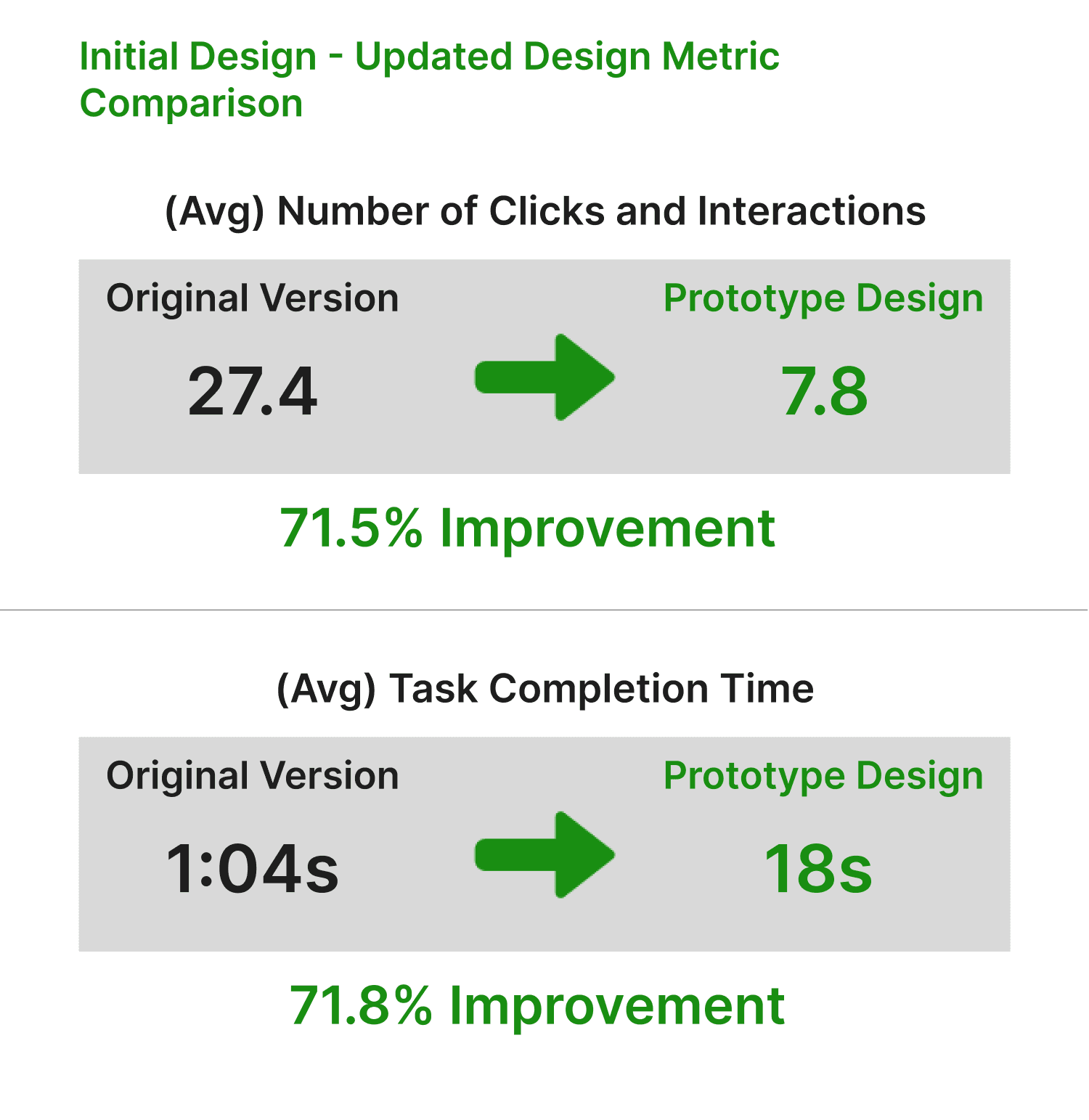
After implementing the latest design changes, I re-evaluated the metrics to measure the improvements in user experience. Initially, the number of clicks and interactions needed to complete a task was 27.4 with a time completion of 1:04.
Post-design update, the results showed significant improvements:
Clicks and Interactions: Reduced to 7.8 clicks, marking a 71.5% improvement.
Time to Complete Task: Decreased to 18 seconds, which is a 72% improvement.
These metrics demonstrate that the updates have substantially enhanced the app's usability, making it more efficient and user-friendly for TD MySpend users.
Learnings
User Feedback Matters: Listening to users helped improve the design by changing the layout based on their needs.
Different Layouts Should Be Tested: Trying out various designs is key to finding what works best for users.
Context Matters for Interaction Design: Users found horizontal scrolling confusing, so switching to a flat screen made it easier to navigate.
